Color
Davidson’s palette of colors provides structured variation within a hardworking brand. Colors are to be used in accordance with the college’s Brand Guidelines (PDF).
Primary Colors
Davidson’s primary brand colors are red, black, and white. Black and white provide high-contrast stability, while red acts as a signature color providing dynamism and vibrance.
Davidson Red
#D42121
R212 G33 B33
C0 M100 Y100 K0
PMS 3546 C
Black
#0F1012
R15 G16 B18
C70 M60 Y50 K100
PMS Black 6
White
#FFFFFF
R255 G255 B255
C0 M0 Y0 K0
Opaque White
Supporting Colors
Supporting colors add sophistication and nuance to an otherwise bold, high-contrast primary palette. Please review the brand guidelines for recommended color combinations.
Sandstone
#E9DED3
R233 G222 B211
C0 M5 Y9 K9
PMS 7604 C
Deep Taupe
#9F8B76
R159 G139 B118
C3 M21 Y37 K43
PMS 4046 C
Lake Blue
#294878
R41 G72 B120
C66 M40 Y0 K53
PMS 4137 C
PMS Cool Gray 1
#F9F5F2
PMS Cool Gray 3
#D4CFCE
PMS Cool Gray 6
#B0ABAB
PMS Cool Gray 8
#8D898A
PMS Cool Gray 10
#6A6869
PMS 7540 C
#4A484A
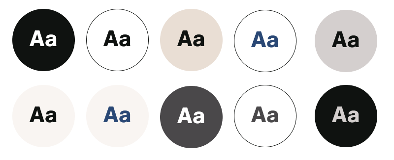
Color for Text
Color combinations must adhere to WCAG AAA contrast standards for normal text, large text, and user interface components. Please refer to the brand guidelines for more details.

